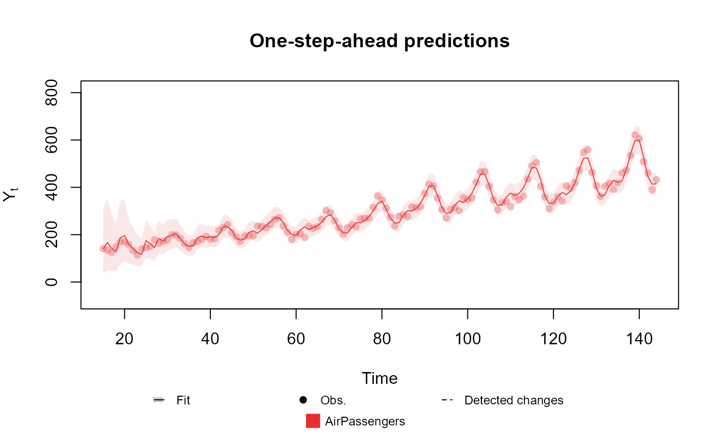
Calculate the predictive mean and some quantile for the observed data and show a plot.
Arguments
- x
fitted_dlm object: A fitted DGLM.
- outcomes
character: The name of the outcomes to plot.
- latent.states
character: The name of the latent states to plot.
- linear.predictors
character: The name of the linear predictors to plot.
- pred.cred
numeric: The credibility value for the credibility interval.
- lag
integer: The number of steps ahead to be used for prediction. If lag<0, the smoothed distribution is used and, if lag==0, the filtered interval.score is used.
- cutoff
integer: The number of initial steps that should be skipped in the plot. Usually, the model is still learning in the initial steps, so the predictions are not reliable.
- plot.pkg
character: A flag indicating if a plot should be produced. Should be one of 'auto', 'base', 'ggplot2' or 'plotly'.
- ...
Extra arguments passed to the plot method.
Value
ggplot or plotly object: A plot showing the predictive mean and credibility interval with the observed data.
See also
Other auxiliary visualization functions for the fitted_dlm class:
plot.dlm_coef(),
summary.fitted_dlm(),
summary.searched_dlm()
Examples
data <- c(AirPassengers)

level <- polynomial_block(rate = 1, order = 2, D = 0.95)
season <- harmonic_block(rate = 1, order = 2, period = 12, D = 0.975)

outcome <- Poisson(lambda = "rate", data)

fitted.data <- fit_model(level, season,
  AirPassengers = outcome
)

plot(fitted.data, plot.pkg = "base")